MSA Fall Protection
Complex environment, simplified message
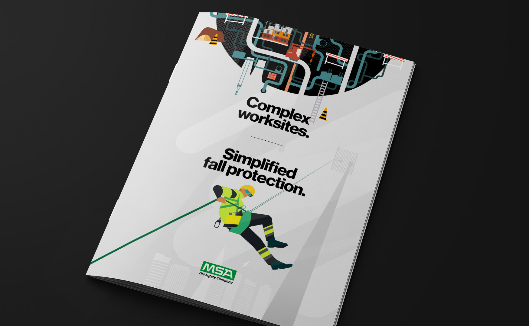
Complex worksites. Simplified fall protection.
Customer Pain Points | Campaign creative
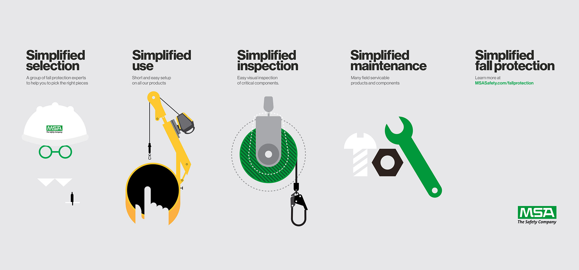
The creative for the campaign was based around four critical pain points for the fall protection customer. 'Selection' hi-lighted how customers have to wade through a myriad of fall protection SKUs which can be daunting, even for fall protection insiders. 'Use' is MSA's promise that no matter how complex their solutions and products are, they will always be simple to use in the field. 'Inspection' alludes to the frequency which fall protection products need to be inspected in the field, and usually under less than ideal weather, so the quicker and easier it is to confirm that a product is able to be used in the field, the better. Lastly, 'maintenance' lets the customers know, if something does need maintenance, it will certainly be as easy as possible, while keeping the worksite safe for all.
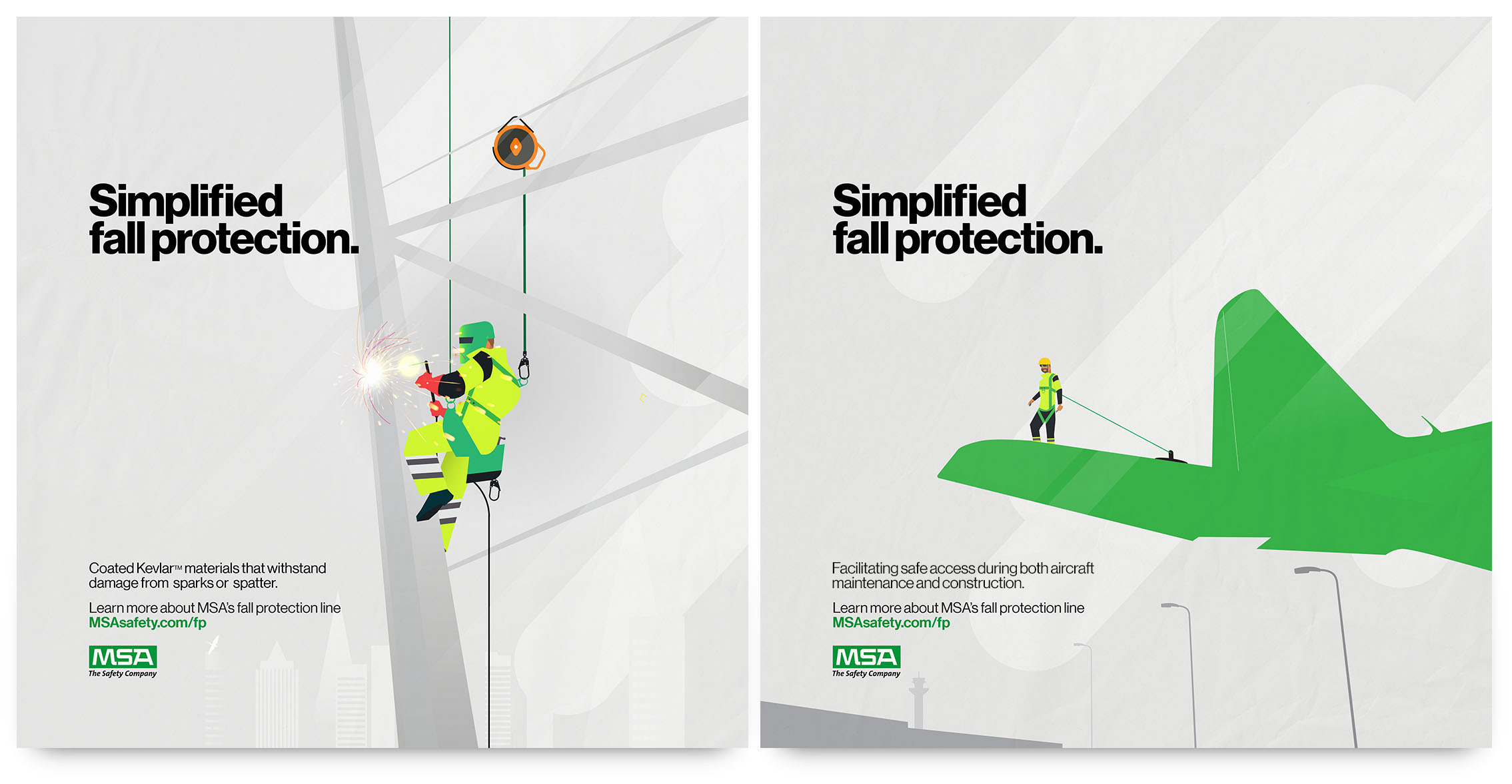
Hero posters
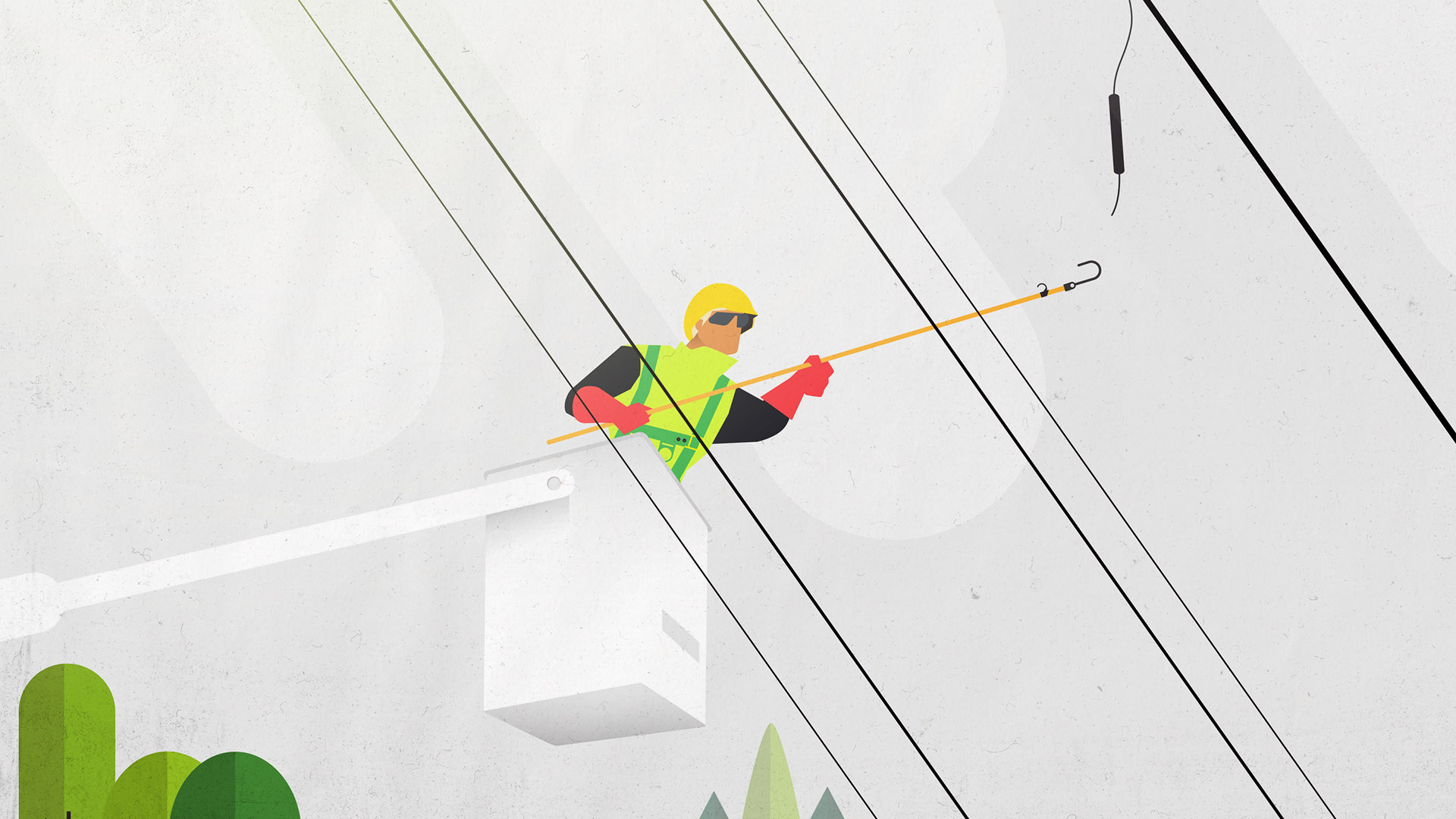
A key extension of the pain points was to depict the brave souls who choose 'work at height' as heroes. Thus a series of key art posters showing workers across categories was needed for the campaign to be used for video, social and digital assets.
MSA Fall Protection Spot | 2:10

Trade Show Booth
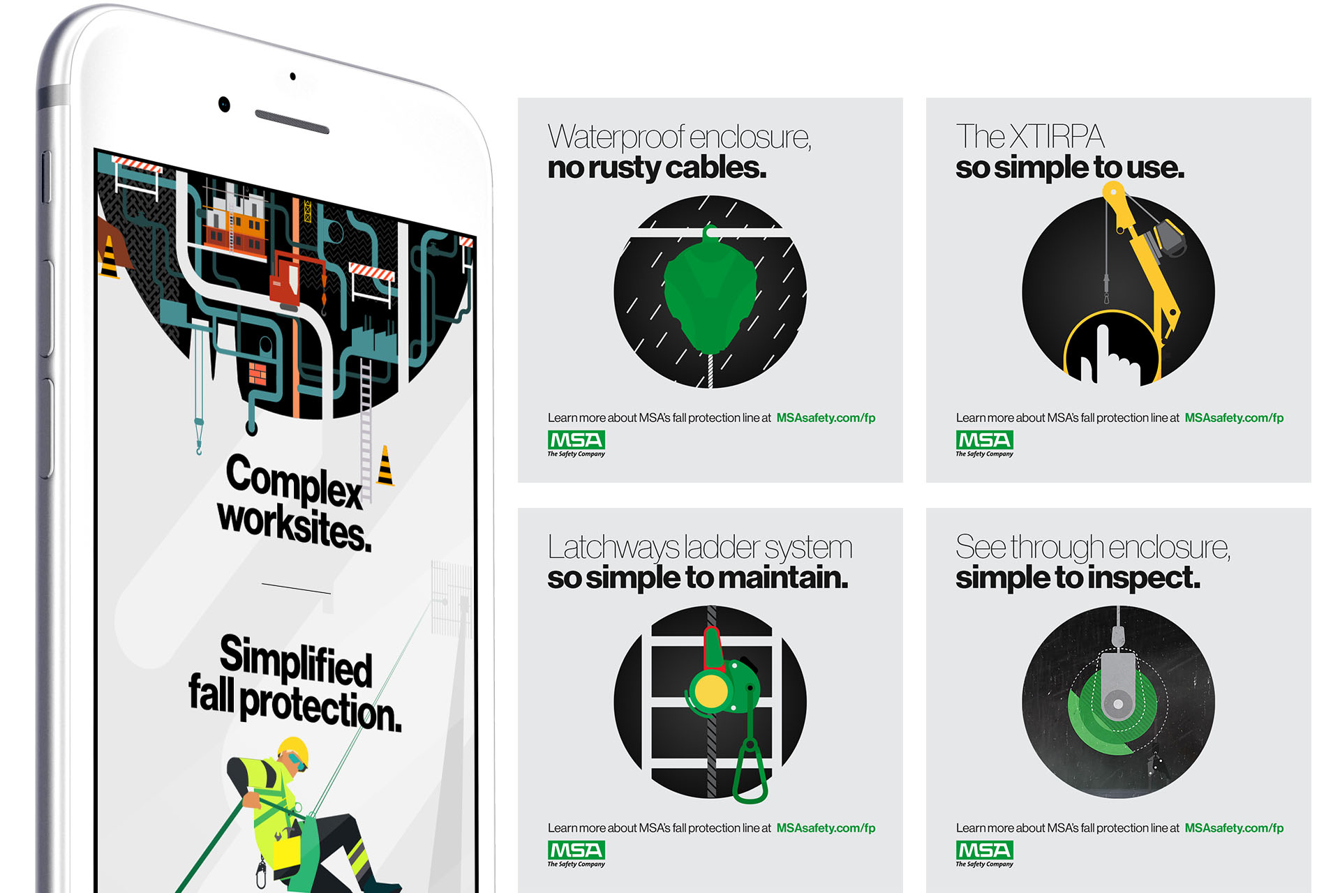
Social content
Adapting the core message for social content, creating focused category and product specific content for social users to snack on.
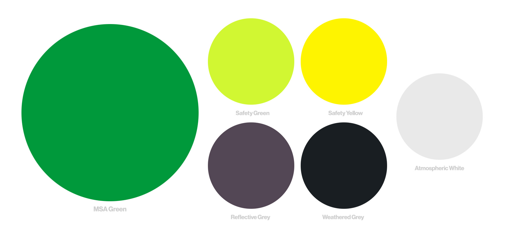
Color Palette
A simplified color palette based on striking safety colors from work sites was created for the campaign to ladder up the 'simplified' communications.
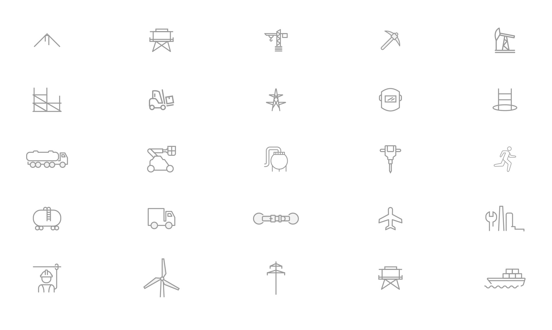
Icon Family
An icon family was developed for the campaign to address all the industries as well as specific uses cases, tools and safety equipment.
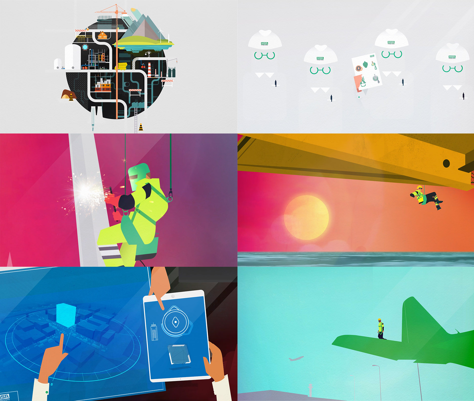
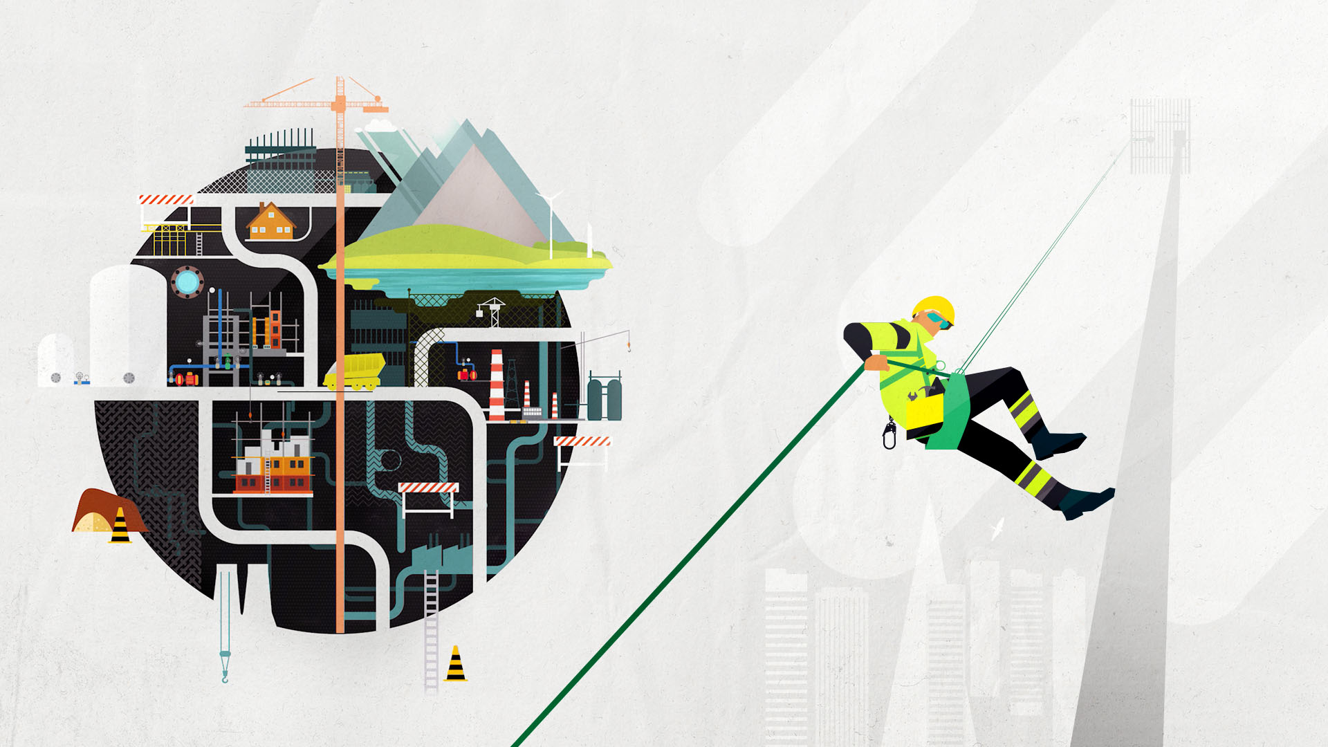
A complex problem, but a simple story
A plethora of different types of worksites, all with distinct dangers with working at height. but MSA's fall protection story helps their customers simplify by having amazing products for each circumstance and helping them pick the right tool for the job.
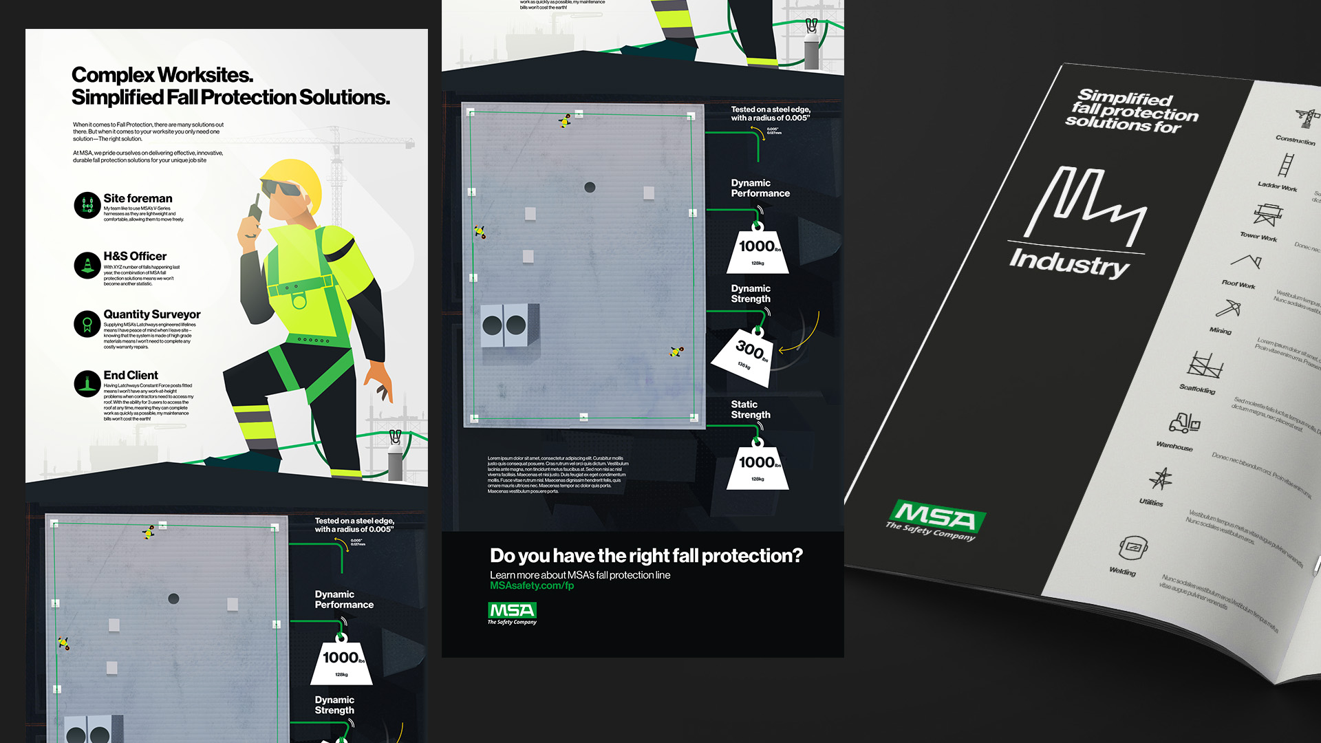
Infographic





![[img]](https://thisisredagency.com/wp-content/uploads/2024/05/Neural-dsp-cortex-control-this-is-red-04.jpg)
![[img]](http://www.thisisredagency.com/wp-content/uploads/2015/09/coke-1.jpg)
![[img]](http://www.thisisredagency.com/wp-content/uploads/2020/08/wolf-trap-animal-rescue-lizzo-logo3.jpg)